Saturday 25 January 2014

Makeup Mistakes

I admit to making these mistakes, but eventually I did learn that I looked a bit silly. I think it can be easy to over do things, or think it looks good at home but when the flash camera comes out - uh oh. I think it's something to do with over exaggerating the current trends, or copying high fashion trends which just don't look good on us ordinary people (ahem Cara's brows.) When I was 13 I used to think powder foundation is what everyone used to use to cover their imperfections, I used to apply layers and layers of it all over my face - silly me. Luckily now, I'm all clued up with make up and although I still have a lot to learn, I'm not making these mistakes anymore.

Brows - The Bad

Eyebrows are so important, if you have good brows the rest of your face is 'going to look a lot better. But nowadays with Cara inspiration, everyone wasn't fuller and thicker brows. I love thick brows, but they've also got to look natural (unless you're going for the fake/drag look!) Here I used a pencil for my entire brow and literally went to town thickening them up. For me, this really doesn't look good. The main problem is the inner part of my eyebrows, filling them in with a pencil really doesn't look good. You can't see the individual eyebrow hairs, and they just tend to look like big caterpillars on your face

Brows - The Good
I think this looks a lot more natural and my subtle (somone might even think they're o natural!) For my eyebrows, I use Anastasia's tinted brow gel to keep the hairs in place and darken them a little, I then go in with Benefit's Brow Zings (just the powder) to fill in the outer part of my eyebrows, and then I use Rimmel's brow pencil to make them a little longer. I don't even touch the inner part of my eyebrows, I think it looks a lot better that way. If you have light eyebrows and want them darker, instead of filling them in maybe try a tinted brow gel - it will make all your eyebrow hairs individually darker (or just actually tint them with eyebrow dye - but that's effort.)

Cheek Contour - The Bad
Looking at this just makes me cringe, WHY! I actually used to do this, but didn't even realize. The problem with contouring is, when you're facing the mirror it looks great - but half the time you forget to look to the side and there's some big ass orange/brown line on your cheek. Over application, the wrong brush, the wrong bronzer. A lot of bronzers tend to be very orange, that works for some people but if you have pale/olive skin it's best to get one that's a darker version of your skin tone (just get your face powder but in a shade or two darker.) Most people like to use smaller brushes for their contour, to really get the angle. But I think that makes it far too defined. Of course, you can blend it out afterwards but I much prefer using a big fluffy brush as that makes it look a lot natural. Only use a little product, and take a flash photograph to see the damage - then add more if you need it.

Cheek Contour - The Good
Here I used Body Shop's Honey Bronzer with a big fluffy brush and just applied a little. It makes your cheek bones stand out, but doesn't actually look like you've put bronzer on. After all, the reason most people use bronzer is to make certain features seem less obvious. With the cheek contour, it's so under neath your cheek bone will "sink" and the cheek bone will stand out more. Applying it subtly actually makes that happen, but applying a lot or the wrong shade won't make your cheek bones look HUGE, it will just make a big brown/orange line on your face. Be careful ladies!

Mascara
Left - The Bad: I used Maybelline's Volume Express Rocket Mascara on both eyes, but here I applied literally TONS of it, and didn't bother moving the wand side to side to remove any clumps. The amount of lashes you see is literlly half the amount compared to the right because they've all clumped together. Doing this makes your make up look messy.

Right - The Good: Here I only used two coats of mascara, and everytime I moved my wand side to side to make sure each individual lash wasn't clinging to another. I find it's best to apply one coat, let it dry for 2 minutes and then apply another. For the bottom lashes, I only ever apply one coat of mascara (using a smaller wand is easier - try getting your hands on a Benefit They're Real tester.)

Eyeliner Flick - The Bad
This doesn't look terrible, but there's a big reason why I don't like it. I used to do my eyeliner like this all the time, until I realized what I was doing wrong. When it comes down to it, the reason everyone loves eyeliner is because it extends your eye and makes them look wider. Here, I've drawn my flick quite low, and so instead of making my eyes look wider and lifting them, it's making my eyes look droopy and small. 

Eyeliner Flick - The Good
sorry for the blurry picture
Here I've made my eyeliner aim toward the end of my eyebrow instead, and by doing this it widens my eyes and makes them look lifted. Here I used Loreal's Ultra Precision SuperLiner, it works wonders. 

Do you have any make up regrets that you wish you didn't do?

Monday 20 January 2014

How To: Dotted Line Under Sidebar/Post Titles

I've seen a few blogs where they have lines under their sidebar gadget titles (Followers, Blog Archive etc) and post titles, and I've always wondered how to do it. After endless searching, I finally figured out it out! I think it looks super sleek, and divides the page up nicely to make it look neat. Here's how you do it, and how to customize it too!


Go to Template > Customize > Advanced > Add CSS

For a line under all your sidebar titles, copy and paste this code: 

aside .sidebar h2.title, .sidebar h2 {
border-bottom: 1px dotted grey;
margin: 0px;
padding-bottom: 0px;
padding-top: 0px;
font-size: 12px;
text-transform: lowercase !important;
font-family: 'times new roman' !important;
}

To under line your post titles, copy and paste this code:

h3.post-title {
border-bottom: 1px dotted grey;
margin: 0px;
padding-bottom: 2px;
padding-top: 0px;
font-size: 12px;
text-transform: uppercase !important;
font-family: 'times new roman' !important;
}

Now for the customization! You'll notice that I've entered my own preferences in these codes, but here's how to change them. 

border-bottom: 1px dotted grey;
This line of code is for the actual line, you can change the 1px to a higher number if you want the line to be thicker. You can also choose for the line to be: 'dashed', 'solid', 'double.' For the colour of the line, you can replace grey with your chosen colour (blue, black, red) or if you want a very specific colour, it's best to use a html colour number (read about that here). For example, if you wanted a 2px thick dashed pastel pink line, you'd type: 2px dashed #FF9999

margin: 0px;
This basically means how long you want your line to be. If you want it to be shorter, enter a bigger number (e.g. 10px) or if you want a longer line, enter a negative number. The default width (0px) of your line will be the width of your blog or sidebar. 

padding-bottom: 2px;

Padding-bottom is the amount of space between the text and the line. If you want them to be close together, enter 0px, or if you want a bigger space between them, enter a bigger number

padding-top: 0px;

Padding top is the amount of space above the line and title. So if you want a space above the titles, add a bigger number. If you want less space, type a minus number. 

font-size: 12px;

This is the size of your font of the gadget/post title (above the line.) You can either totally remove this if you want your font to be what you've customized it to be already, or make the number bigger or smaller to alter the size. 

text-transform: uppercase !important;

This line is for the title text. You can either add 'uppercase', 'lowercase' or simply remove it if you want the text to be normal. 

font-family: 'times new roman' !important;

If you want a different font family for the text, simply add the name of the font within the quote marks (this won't work with downloaded fonts.) 

Let me know if you have any troubles with this, I'll come to the rescue! 

Sunday 19 January 2014

Current Fashion Trends

This Winter has been great for fashion trends, and I'm excited for what the rest of 2014 has in store for us. From mono colours to fluffy jumpers and logo t-shirts, there's many different trends I'm in love with at the moment. 

"Word Up!"
I love wearing these types of t-shirts, I have the kangeroo Monki t-shirt and it's a staple piece of mine. Slogan t-shirts make your outfit fun and casual. 
Smoking Granny Clover Canyon T-Shirt £100 Hiya Topshop T-Shirt £16 Kangeroo Monki T-Shirt £8

1920's
I'm pretty sure The Great Gatsby inspired this, but regardless - I'm thankful. Sequins and pleated dresses are to die for, along with the finger curls, deep red lips and faux fur. To die for"


Miss Selfridge Flapper Dress £150 Jigsaw Flapper Dress £41 Dorothy Perkins Faux Fur Coat £55

Fluffy Jumper
No one can deny a fluffy jumper, especially me. They're super comfortable and look trendy, I especially love the pastel colours.


Topshop Blue Jumper £34 Topshop Pink Jumper £34 Topshop Cream Jumper £29

Midi Rings
I'm in love with midi rings, I think they complete my outfit along with a nude lipstick. The only thing is they constantly slip off, I've lost one or two of them because of that. If you're going to buy them, get sterling silver! Or your fingers will turn green and your ring will turn a brass colour, I've learnt the hard way.


Regal Rose Initial Midi Ring £20 Dixi Arrow Midi Ring £14 Regal Rose Sun & Stars Midi Ring

The Embellished
Embellished jumpers, embellished dresses, embellished shoes - embellished everything!


Zara Embellished Slippers £19.99 Topshop Embellished Skirt £42 Topshop Embellished Jumper £40

Wednesday 15 January 2014

Review: Stila Artful Eye Collector's Edition Vol. II Palette

For Christmas, my mum simply told me to link her to the things I want. I'm pretty picky, so picky that it took me hours to even pick something myself. Of course, I was troubled with many options of eye shadow palettes: Urban Decay Naked 3, Lorac Pro, Naked Basics, Pixi Palettes...the list goes on. I then stumbled across this little collector's edition palette by Stila, five eye shadows and all beautiful colours. And at £15, I simply couldn't resist. If you're from the UK like me, I'm afraid the only place I've been able to find that sells them is Selfridges, of course people in the US can probably just walk in and buy it from anyway (ahem Lorac Pro Palette.) 

From left to right: Patchhouli, Ember, Sandalwood, Rosewood, Eclipse

For me, the shades are to die for. 3 copper and gold shimmer shades (which are great for a smokey eye) and a light beige and black. Usually I stay away from many palettes, because I know I won't use half the colours, but I use all of these equally. I use the Patchouli all over my lid, Ember as a crease, Rosewood in the outer corner, Ember in the middle of my lid, and Eclipse along the lash line. If you're a fan of copper and gold shades, this is a must. 

The colours are very vibrant and blendable, a few swishes on your eyelids and you're done. I think the black could be a little darker but it is buildable. They are shimmery, which could put some people off, and perhaps these were meant for the party season. But I say hell no to all that rubbish, I want to be shimmery 24/7! 

If you're a neutral palette freak like me, I think this palette would be great for you. I've been using it non stop and copper/gold lids is my new make up look. 

Have you discovered an eye shadow palette?  Let me know, I need some more lid love in my life!

Sunday 12 January 2014

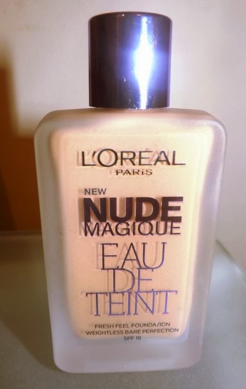
Review: L'ORÉAL Nude Magique Eau De Tent Foundation

Today I went on a make up spree and got tons of stuff. One of the things I was excited to get was the new L'oreal Nude Magique Eau De Tent Foundation (why do they make such long names?) It's a new formula that's supposed to be weightless and feels like water. It also has an SPF of 18, and claims not to clog your pores. On first impressions, I really love the packaging. It's in a thick glass bottle with a shinny purple cap - however I much prefer a pump rather than pouring it onto my hand/brush. 

When I first dabbed a little on my arm, I was slightly confused/amazed. It's very water based, more than any foundation I've used. But not as thin as water, like they claim - water wouldn't stay on my arm, it would drip right off! The smell isn't great, to me it smells like alcohol or disinfectant, so that's a definite down side. 

I was expecting the coverage to be minimal, and it to feel like a BB/CC Cream rather than a foundation. I was pleasantly surprised because actually, it has more of a medium coverage. When I was putting it on, I couldn't even feel it - it's like I was brushing nothing into my skin - for a very watery foundation the coverage is really good. It also made my skin feel really silky and soft.

I have dry skin, and I feel like this foundation works well with my complexion and skin type. I don't think it would be great for very oily skin, but other than that I think it would work well with most skin types. The colour range isn't great (mine is soft beige) but I think that's probably because it's a new product and they're testing the waters first. It's priced at £9.99 at Boots, and has 20ml. I would prefer a little more product for my money considering it is a drug store foundation, but we'll see how long it lasts. 

Overall this product is really good, in my opinion. It has good coverage, a "no make up feel", and looks vibrant and glowing on the skin. Make sure you give it a sniff first though, because the smell really is off putting. 

Have you tried any new foundations recently? Let me know, I'm on the hunt for new products!